The Norwegian Food Safety Authority adopts a new visual identity for increased efficiency, user-friendliness, and to comply with universal design
With our new expression, we aim to communicate and guide more effectively, better encompass the breadth of our societal mission, and demonstrate our commitment to be of assistance.

The Norwegian Food Safety Authority's visual identity, established in 2004, does not meet the current standards for digital platforms and universal design.
– Our objective is to cultivate a clear and integrated image that bolsters the development of the Food Safety Authority. A significant aspect of this is complying with the legal requirements for universal design. We are continuously developing this, maintaining cost-efficiency by gradually replacing elements and utilizing our internal staff, explains Director User Dialogue and Corporate Communications Andrea Kilen.
The New Visual Identity: Universally Designed for Enhanced Efficiency
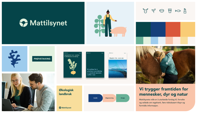
Our refreshed expression ensures accessibility to our digital platforms by adhering to universal design standards. Key initiatives include a new logo, updated color palette, and a legible, accessible font.
This new identity provides us with a toolbox for developing innovative digital products and services, enabling us to resolve challenges independently and efficiently. It also ensures that businesses and citizens encounter a cohesive image, whether they visit our website, interact with us during inspections, or read the Smilefjes report at a dining venue.
New Identity to Clarify Our Role and Actions
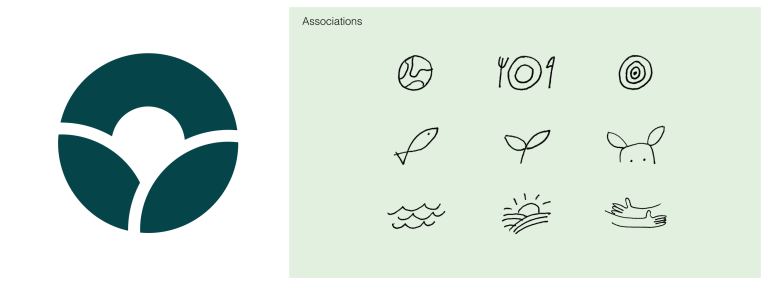
Our new visual identity is designed to simplify public understanding of who we are. The Food Safety Authority has a significant and wide-ranging societal mandate. We wish to be a friendly helper, and interact in a unified and clear manner with our surroundings. Our mission is to secure the future for people, animals, and nature, engaging with the entire value chain. This is symbolized by the distinct circular form in our new logo.
In our effort to communicate clearly and simply, we have created a new logo with minimal detail. It offers high readability and is easy to apply across digital and physical platforms. The new symbol may evoke images of the Earth, a leaf, a fish, waves, or the sunrise.
Cost Efficiency Achieved Through Internal Staffing and Gradual Rollout
A primary concern in developing the new visual identity has been cost containment. This has been achieved largely through leveraging our in-house team. Cost savings are further realized by implementing changes gradually, starting with our website and selected digital templates. Hence, we will be operating with both the new and old identities concurrently for some time.